Customers form an opinion quickly
A customer can walk into a shop and understand a surprising amount without speaking to anyone. They notice how easy it is to move around, whether products are easy to find, how busy the store feels and whether everything appears looked after.
None of this necessarily happens consciously. It is simply part of how people navigate unfamiliar spaces.
That makes the physical setup of a store more important than it sometimes gets credit for. Fixtures, lighting, product spacing and even the condition of the checkout area all contribute to the first impression.
The entrance has a job to do
The first few metres inside a store shouldn’t be treated as spare space.
Customers need somewhere to enter and get their bearings before they start browsing. If the entrance immediately confronts them with a wall of merchandise, narrow aisles or several competing displays, it can make the shop feel smaller and harder to navigate.
A little open space can actually make the merchandise beyond it more noticeable.
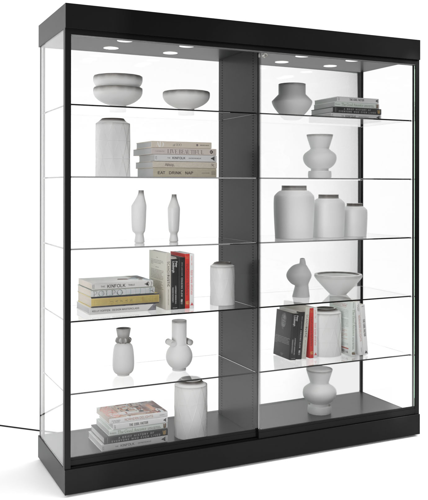
Give important products some breathing room
Once customers move further into the store, the same principle applies to individual displays.
Trying to show too much at once makes it harder to tell what deserves attention. A feature product or collection usually benefits from having some space around it rather than being squeezed between unrelated items.
This doesn’t mean leaving half the store empty. It means being selective about where visual density is useful and where it isn’t.
The counter is part of the impression
The checkout area is another place where customers naturally form an opinion about the business.
It needs to work for staff, but it also needs to look organized from the customer side. Receipts, bags, packaging and equipment can quickly make a counter look chaotic if there isn’t enough dedicated storage.
A glass display counter can be particularly useful where a retailer wants the checkout area to serve another purpose as well, such as displaying smaller products or items that benefit from a more secure presentation.
That allows the counter to contribute to merchandising without simply becoming another obstacle on the sales floor.
Keep practical details out of sight
There is nothing wrong with a store looking like people actually work there. The problem is when everyday operations spill into places customers need to use.
Delivery boxes left beside displays, tangled cables, spare packaging and overflowing bins can make an otherwise decent shop feel unfinished.
Good storage doesn’t eliminate these things. It gives staff somewhere sensible to put them.
Consistency matters more than matching everything
A store doesn’t need every fixture to look identical. In fact, mixing materials and fixture types can make a space more interesting.
What matters is that the different elements feel as though they belong together. Similar finishes, sensible spacing and consistent product presentation can tie together fixtures that serve completely different purposes.
A display cabinet, shelving unit and checkout counter don’t need to be from the same range to work in the same room.
The best impression feels effortless
Customers shouldn’t have to think about why a store is easy to shop. They simply move through it, find what they need and interact with the products.
That usually comes from dozens of small decisions rather than one dramatic design feature.
Keep the entrance clear. Give important merchandise room. Make the checkout practical. Hide unnecessary clutter. Keep displays maintained.
Those details may not be what customers remember individually, but together they can determine how comfortable the store feels.